What does Life By Design offer me?

Follow Me on Pinterest
Showing posts with label paint. Show all posts

Sunday, February 26, 2012

Top Spring 2012 Color Trends! Great Job, Pantone!

Okay people...let's talk color!  You will be seeing many items for the home that are inspired by this group of colors that are tops for Spring 2012 as presented by Pantone.  I already have my favorites and I look forward to adding some flair to my home with Solar Power and Sodalite Blue!  Let's take a look-


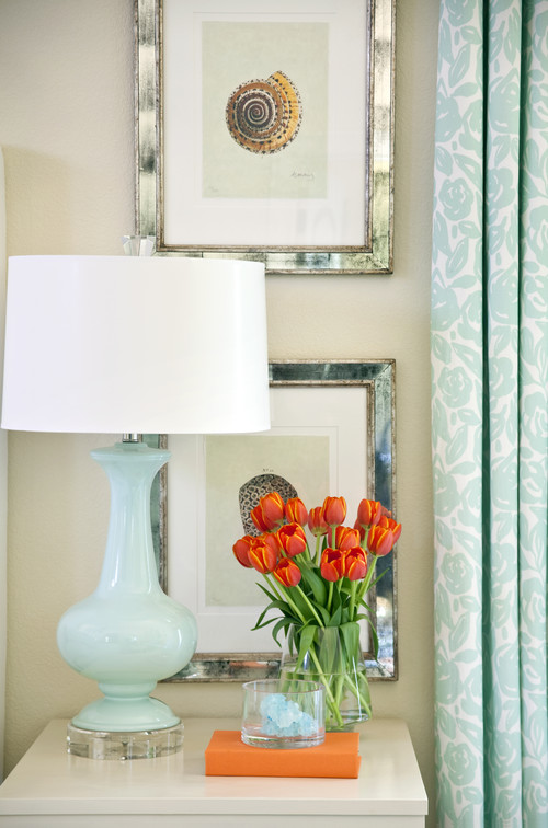
Chances are, you already have some version of at least one and maybe more of these colors in your home!  And it is really very simple to "freshen up" without overhauling!  For example, your living room may be decorated in classic blue and white with accents of one other color.  After you take a look at this list, you find that you really like Sodalite blue and you begin to see a lot of accents in stores that appeal to you, as well.  Let's say that the color blue in your home is a lighter shade of blue than Sodalite and it has some gray in it.  Perfect!  Start with accent pillows and mix deeper Sodalite pillows with your lighter shade of blue.  Add a lamp in a beautiful Sodalite color!  This will add much more depth to your blue and white room and you still keep the classic combination.   Even better,  if  the color Driftwood appeals to you, then it presents another opportunity for accents in this room in combination with the blues and whites!  Anything like picture frames, candlesticks, throw blankets, pillows and even a rug in these colors will be beautiful in your room and you will still maintain that integrity of the classic color combination!  


Greenwich Penthouse traditional living room
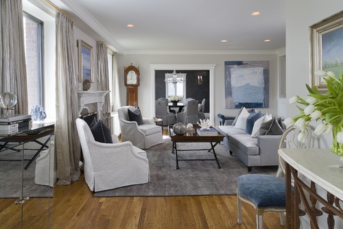
                              traditional living room design by new york interior designer Tiffany Eastman Interiors, LLC

Notice all of the different tones of color in the pillows and the beautiful grays that have been incorporated in the palette.  This is a very rich and interesting way to keep a clean palette without it falling flat.


Amoroso Design contemporary living room
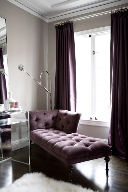
                                 contemporary living room design by san francisco interior designer Amoroso Design


A beautiful and effective example of lilacs and grays!  As you look at the trends, you can infuse different variations of grays and lilacs to "update" the palette that is already in your home!


purple in the room contemporary living room
                                                                                                  contemporary living room design

 Add a little "Cockatoo" to your palette as well!


Harlem Apartment - Hall eclectic entry
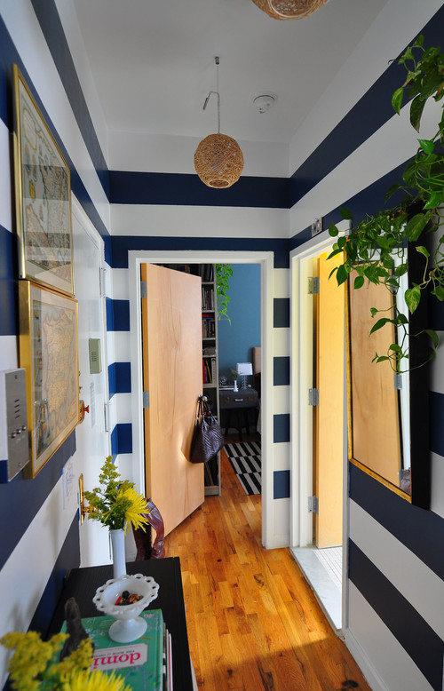
                                                                                   eclectic entry design by austin interior designer Frisson


Above, you see a vibrant and dynamic version of Solar Power and Sodalite Blue!  If you have a home with a lot of black and white, or black, white and gray....then Solar Power would be an amazing choice to add to your palette with fun accents.  You could also try cabaret with those color palettes.


Master Bedroom  bedroom
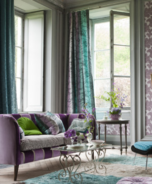
                                                                      bedroom design by new york interior designer TILTON FENWICK


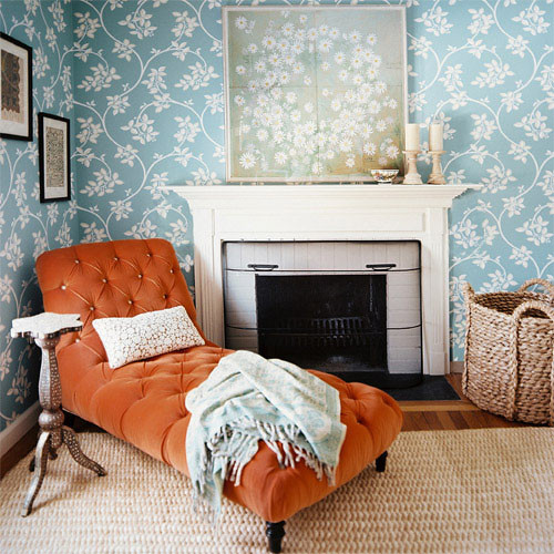
As you can see, the combination of blues and oranges are always striking.  Depending on your style, you can gauge the intensity of color that you want to use, as well as the amounts of each color in the room.  This year, the top color on the list is actually Tangerine Tango... and the perfect partner is a version of cockatoo!


Energy House traditional bedroom
                                                                 traditional bedroom design by little rock interior designer Tobi Fairley


WELLTON APARTMENTS INTERIOR contemporary dining room
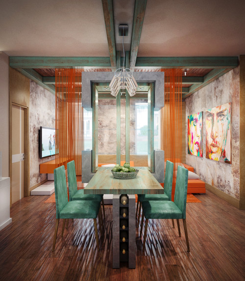
                                                                                   contemporary dining room design by architect Annis Lender


So take a look at the top colors for the spring and if one really speaks to you, then consider adding it to one of your rooms in your home.  Often, when you know you may be adding accents, it is best to step back from your room and edit any pieces that look extraneous.  Maybe they should go in to a cabinet for storage or maybe they are a little worn and could be given to a charitable cause.  Only add accents to a clean and properly edited room ( "edited" does NOT mean getting rid of your sofa or entertainment center).

Good luck and have fun!  Share your favorite colors from the Spring Color Trends with us! How will you add some interest to your home with colors from this palette?

Monday, August 29, 2011

A "Benjamin Moore" Love Affair

Okay, So I have been a little naughty... I just needed a long weekend from posting this time and I am refreshed! I have been working on several projects both at home and with a friend and client.  I will have some fun photos of the transformation of my client's project soon!  One of my personal projects has been repainting my living room and mantle.  Over the past year or so, I replaced the larger pieces of furniture and I knew that I would have to change the paint to complement the new pieces.

I am thrilled with the walls and the mantle!  Next I will tackle the trim!  The palette I chose includes:

Benjamin Moore's Blair Gold-walls

Benjamin Moore's Olive Tone- all trim

Benjamin Moore's Amazon Green- mantle & accent

Benjamin Moore's Caliente-accent


As I mentioned above, I have completed the walls and the mantle, but I have not yet started on all of the trim, this will be yet another transformation!  In the photo's below, the door/window that is on each side of the mantle will be painted the olive tone, NOT white.  So once this is completed , I will share the final photos as well.  

I couldn't be happier!  The mantle is truly the focal point of my room and it is often a major element in most living areas so do not be afraid to paint it a beautiful color!  Again, life is too short to have a white or cream mantle by default.  It is a great way to transform the look of a room with very little cost and effort.  In fact, if you want a big bang for your buck, you could paint your mantle or mantle surround (whichever you have), and replace some items on the mantle, the wall over the mantle and even on the hearth area in a weekend! This would change the whole focal point of your room with only the cost of paint, a little time and simply using items to replace from around your home!  Voila!


Okay, so now I need to get started on the trim!  Wish me luck!  Have you painted any new spaces lately?  What was the palette?  Have you tried a mantle transformation in the past?  Please share!

Monday, August 22, 2011

Color Outside of the Lines...

Are you familiar with Pantone?  Most people have heard the name and  some know that they are associated with color in some form, but that is probably about as far as it goes.  And in many cases that is enough ...sort of.  By taking a moment to explore the Pantone website,  you further enrich your knowledge and appreciation of color AND you become aware of yet another amazing resource that is easily accessible whenever a little help is needed.

www.pantone.com

Pantone is the world's leading authority on color and provides color systems/ palettes that are standardized across many industries and are utilized for everything from color matching to developing fashion and home color trends every season.  Basically, Pantone plays a role in your life everyday...whether it is the new jacket you just purchased (one of Pantone's top color trends for fall 2011),  the sofa on which you are sitting ( from top home interior color palette for 2010?), or your favorite website (graphic designers must always be on top of color trends).

Well, how can Pantone be a resource to you in a more practical sense?  Easy...Are you planning on painting a room, reupholstering a piece of furniture, putting together a nursery for a new arrival?  Or maybe you have a beautiful dress and need to see some color options for accessories, or selecting colors for a wedding?

Next stop, www.pantone.com.  You can become a member for free and you have access to some great tools and some beautiful archived color combinations.

www.colourlovers.com


You should also make sure to frequent colourlovers .com for some beautiful combinations and ideas.  You can search color palette trends, top colors for crafts, top colors in print and interiors.

www.colourlovers.com

www.colourlovers.com


Now, no excuses for not using color and trying some fabulous and daring combinations!  Go ahead, step a little closer towards the edge...trust me, it is a lot more fun!

Thursday, August 18, 2011

It's Thursday... Etsy Treasury Feature Day! oh..and one more day 'til friday.


Often we get ready for an update to our home, and usually it is one or two rooms at a time. We can get a little overwhelmed with where to start but we know we want a change. My first choice is always a color palette and paint. For me, it establishes a solid foundation on which to start. But I have had many friends who get nervous about color and end up selecting cream or white walls simply by default...and a little bit of fear.

One way to break into a more interesting group of options, if you are not quite ready for a broad or intense palette is to select one color and use multiple tones and many different textures. This will create a more layered look and will also add warmth and interest.

This is shown in the treasury featured today. I selected a beautiful warm gold color and simply added different tones as well as textures. It certainly represents a home I would love to live in! How about you? Do you have any rooms in your home that are based on one "foundational" color with selected tones and textures throughout the room?

Monday, August 8, 2011

An Entire Custom Color Palette at Your Fingertips, Voila!

Do you ever rip pages from magazines of "wishlist" items or keep pictures of beautifully decorated rooms in a file folder for future projects?  Or maybe you are the resident photographer with thousands of carefully catalogued images spanning every special moment experienced within the family over 20 years?

Photography, in all forms, has a profound effect on our lives.  It can document our memories, influence how we perceive ourselves, evoke feelings of empathy and give our dreams a visual context.  Often we find that when we refer back to our own personal collections of images, however scattered they may be, there are common themes.  One of those themes for instance, may be color or color combinations.

This would be most obvious in pictures from magazines that we have collected to admire or replicate in our homes.  I  love strong colors and there are definitely catalogued pictures of mine that evoke a noticeable feeling  of energy and  happiness when reviewed!

I recently discovered a tool online that has changed my world! Okay, maybe a little overstated, but it is a tool that can take any photographs and upon loading them, can create a color palette from the range of colors in the photo.  Imagine the possibilities!  I have so many images that I look at and think,  "what if I could turn the beautiful colors in this photo into a home studio?"  or "What if I could take this photo of the boys at the beach and use the same colors in a playroom?"

The applications and the potential for inspiration are endless!

Here is a photo I took in the bahamas and I have always loved the colors.

I utilized two different color palette generators to see what magic could be created! The first generator is from a website called bighugelabs.com/colors.php

www.bighugelabs.com/colors.php

The next color palette generator tool I utilized was from a website called www.colourlovers.com/photocopa.

www.colourlovers.com/photocopa

Take a look at some of your photographs and visit one of the sites to give it a try.  You may be surprised at some of the colors that are generated and are perfectly paired.  There are several other sites as well.  Some sites require that you have the URL of the image, which would mean it would need to be on a hosting site like photobucket(which is simple) and some sites only ask you to download the image directly from your computer.  Benjamin Moore, Here we Come!

Saturday, July 16, 2011

Is Your Home Suffering From "Ivory Wall Overload?"

  • Do you refrain from hanging art on your walls because you don't want to put holes into them?
  • Did you purchase your home years ago and you just never got the chance to paint over the builder's white?
  • Have you chosen not to paint your walls because you are scared you are going to choose the wrong color?
  • Do you think that by painting your rooms different colors that it will mess up the flow or continuity?

Well this interventional blog is for you!   First let me make one important point.  Of course one can have white, cream or ivory walls in his/her home!  Just make sure that the white, cream or ivory colors are ones that you have carefully chosen because they fit your home's personality and decor.  Also make sure that these colors are not present because of the "fear" of painting another color.

Let me put your mind to rest.  In most cases where an entire home has the same color walls or where every room features default white or cream, there is no flow to "mess up."  The same color ivory throughout an entire home does not equal a continuity of style or interest.  It usually equals boring.

Especially today....when there are so many beautiful paint colors in many different paint lines, there are thousands of colors from which to choose.  And remember that continuity of style and interest can be obtained in many ways, but especially with a beautiful palette of complementary colors!

Again, the warmth and personality of a home is established through layers of texture, art,  fabrics, paint and furniture.  One can become preoccupied with a lot of "shoulds" and rules, or one can enjoy the process of creating a warm home that is a reflection of his or her personality.

Tip:  Paint is your friend and there is no such thing as a paint emergency!  Why?  Because paint can be easily covered with another color! So go for it.  Don't hold back! Choose beautiful color and live life on the edge!

One of the most beautiful palettes comes from Philips Perfect Colors!  I have chosen 4 colors that I would like to see in a sunroom! or...okay...in practically any room!

Room Color
 Trim Color
 Accent Color
 Accent Color

Imagine this beautiful lemon grass colors on the walls with this trim color that is actually interesting!  And then layers of these accent colors throughout the room from distressed painted furniture to pillows to just about anything!  Thank you to Philip's Perfect Colors for such amazing choices.
Related Posts Plugin for WordPress, Blogger...