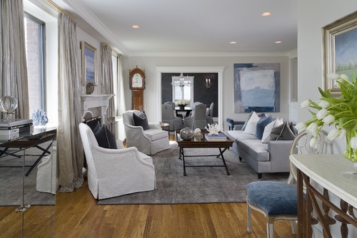
Chances are, you already have some version of at least one and maybe more of these colors in your home! And it is really very simple to "freshen up" without overhauling! For example, your living room may be decorated in classic blue and white with accents of one other color. After you take a look at this list, you find that you really like Sodalite blue and you begin to see a lot of accents in stores that appeal to you, as well. Let's say that the color blue in your home is a lighter shade of blue than Sodalite and it has some gray in it. Perfect! Start with accent pillows and mix deeper Sodalite pillows with your lighter shade of blue. Add a lamp in a beautiful Sodalite color! This will add much more depth to your blue and white room and you still keep the classic combination. Even better, if the color Driftwood appeals to you, then it presents another opportunity for accents in this room in combination with the blues and whites! Anything like picture frames, candlesticks, throw blankets, pillows and even a rug in these colors will be beautiful in your room and you will still maintain that integrity of the classic color combination!
traditional living room design by new york interior designer Tiffany Eastman Interiors, LLC
Notice all of the different tones of color in the pillows and the beautiful grays that have been incorporated in the palette. This is a very rich and interesting way to keep a clean palette without it falling flat.
Notice all of the different tones of color in the pillows and the beautiful grays that have been incorporated in the palette. This is a very rich and interesting way to keep a clean palette without it falling flat.
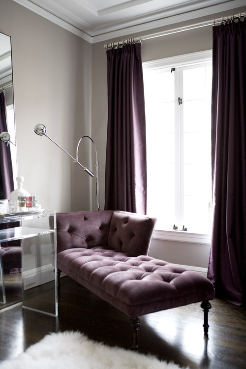
contemporary living room design by san francisco interior designer Amoroso Design
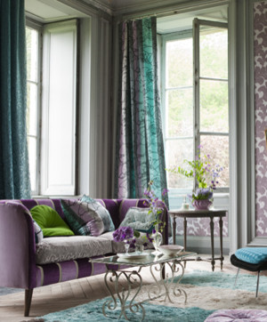
A beautiful and effective example of lilacs and grays! As you look at the trends, you can infuse different variations of grays and lilacs to "update" the palette that is already in your home!
A beautiful and effective example of lilacs and grays! As you look at the trends, you can infuse different variations of grays and lilacs to "update" the palette that is already in your home!
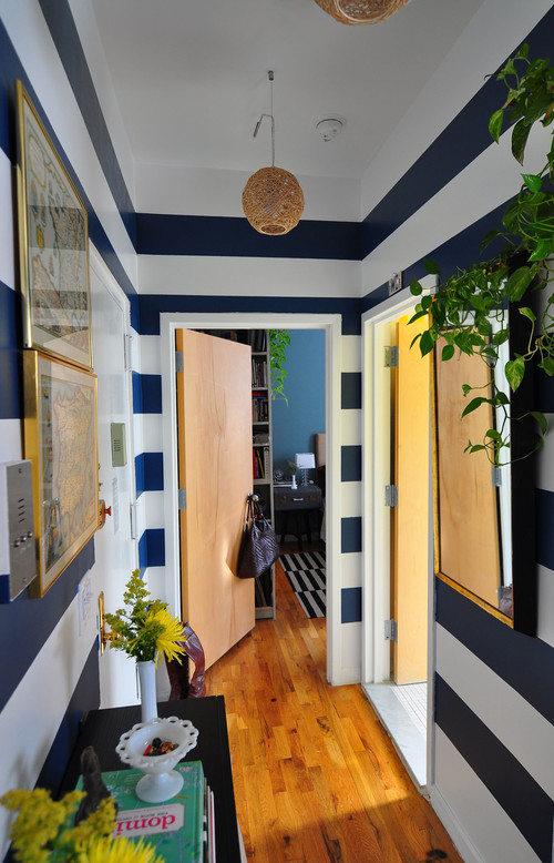
eclectic entry design by austin interior designer Frisson
Above, you see a vibrant and dynamic version of Solar Power and Sodalite Blue! If you have a home with a lot of black and white, or black, white and gray....then Solar Power would be an amazing choice to add to your palette with fun accents. You could also try cabaret with those color palettes.
Above, you see a vibrant and dynamic version of Solar Power and Sodalite Blue! If you have a home with a lot of black and white, or black, white and gray....then Solar Power would be an amazing choice to add to your palette with fun accents. You could also try cabaret with those color palettes.
bedroom design by new york interior designer TILTON FENWICK
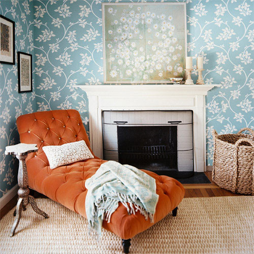
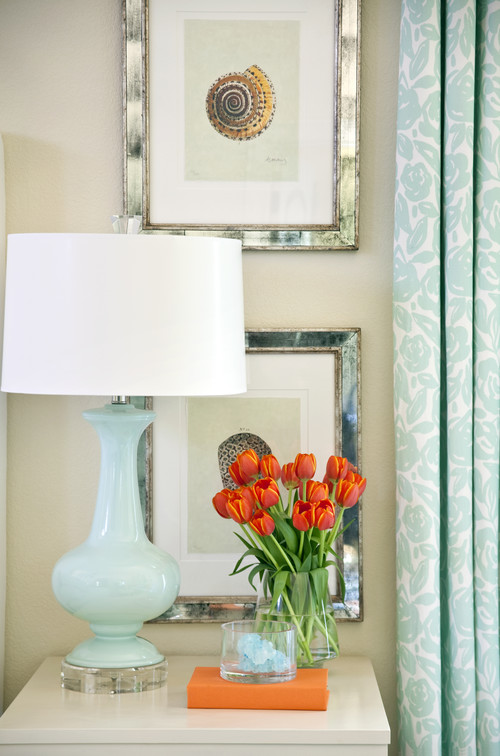
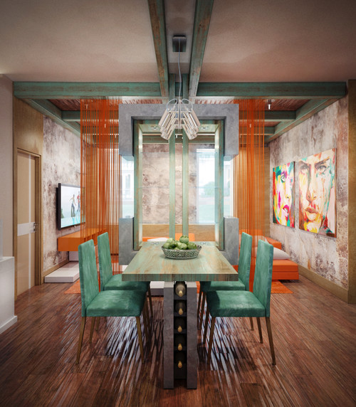
As you can see, the combination of blues and oranges are always striking. Depending on your style, you can gauge the intensity of color that you want to use, as well as the amounts of each color in the room. This year, the top color on the list is actually Tangerine Tango... and the perfect partner is a version of cockatoo!
As you can see, the combination of blues and oranges are always striking. Depending on your style, you can gauge the intensity of color that you want to use, as well as the amounts of each color in the room. This year, the top color on the list is actually Tangerine Tango... and the perfect partner is a version of cockatoo!
contemporary dining room design by architect Annis Lender
So take a look at the top colors for the spring and if one really speaks to you, then consider adding it to one of your rooms in your home. Often, when you know you may be adding accents, it is best to step back from your room and edit any pieces that look extraneous. Maybe they should go in to a cabinet for storage or maybe they are a little worn and could be given to a charitable cause. Only add accents to a clean and properly edited room ( "edited" does NOT mean getting rid of your sofa or entertainment center).
Good luck and have fun! Share your favorite colors from the Spring Color Trends with us! How will you add some interest to your home with colors from this palette?


No comments:
Post a Comment
Thank You For Your Comments!